This is actually a restart of my thread “My market profile trade plan”. The reasons are three folds. Firstly, I didn’t start the thread with a proper introduction of the philosophy or methodology, hence not many people have any clarity on what I am talking about and how to use the material I shared. Secondly, the thread started hastily that I haven’t thought through what I want to share and what I want to achieve by writing those posts. Last but not least, my trading is structured around two sessions, London session from 9:00 AM to 12:30 AM CET when I trade mainly DAX and CAC on the side, and NY session from 15:00 PM to 18:00 PM when I trade mainly NQ and ES/YM on the side. In between there is an occasional FX session that I follow losely a couple of major Forex pairs before the NY open (13:00 PM to 15:00 PM). Since the US equity indices have very different personalities than those of European counterparts, a better approach is to structure my journal to those two distinct sessions so that I would have more of the coherent flow and harmonized content in each thread.
Goals:
Writing a journal is about to bring accountability into my trading and accountability induces professionalism. Putting my journal in front of the public is not about showing off or bragging about myself by only showing the winning trades. It is about acting with full honesty and total transparency that I would expose both the bright side and shadow side of my ego. I am aware that my ego loves to be right even more than to be profitable. It loves to pick tops and bottoms so that it feels like on top of the world. My ego also loves instant gratification that it prefers quick but small profit instead of the slow but large profit. The best form of response to the ego is not to criticize them but to expose them under the sun and let the ego dissolve like the candle flame in the sea of overwhelming sunlight.
Description of the methodology:
The methodology can be described by the acronym B.A.P.:
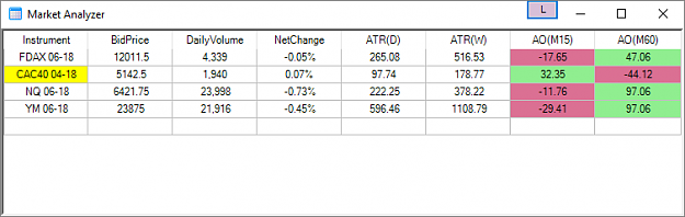
B(ias) -- The directional bias describes the sentiment of the higher time frame player. This bias is derived from the market profile chart (see later section for more details)
A(rea) -- Area of interest is the location where either the responsive or initiative players are likely to step in the market to either initiate a move or defend their position. It is mostly derived from the market profile chart (see later for more details).
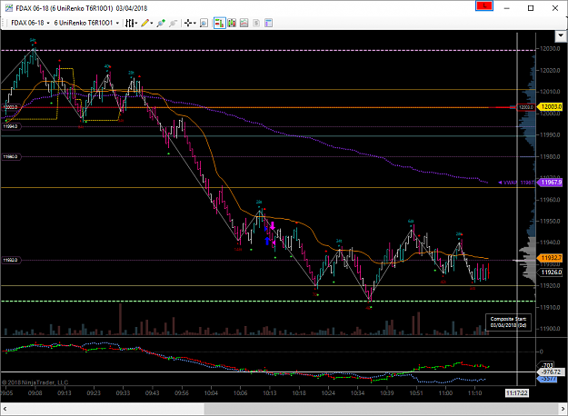
P(attern) -- Short term price action pattern helps me to refine entry. The patterns that I am watch in the uniRenko charts are, Wolfe pattern, cup and handle, Harmonic patterns and so on.
Premise of the methodology:
Firstly, Market profile is not an indicator. If you are looking for an indicator which gives you buy or sell signal, then this thread is not for you. The goal of the market profile is to visualize the context. It seeks to bring the background to the forefront.
You might ask, what context you are talking about here? Does market profile describes the economy or the monetary policy? The answer is no. The market profile depicts how the speculators, your competitors, are positioned in the market. Believe it or not, 80% of the market movements are not caused by the new money coming into the market but by the repositioning of the higher time frame speculators that are in the market already. This process is called inventory adjustment. The inventory adjustment could be caused by a shift in the sentiment, change in the fundamental condition, or simply, correcting an excessively long/short inventory. Please refer to Jim Dalton’s book, Market in Profile, for detailed discussion over the topic of inventory imbalances.
I truly don’t know and don’t care about the true cause the higher time frame trader’s inventory adjustment activity. But I can decypher those activities in the market profile charts. There is no better way to gain an edge than knowing how your competition is feeling, the probability of what they are doing, and how they are likely to react? The million dollar question is how?
Remarks: Why Market profile works
I don’t want to bloat my post to several page long preach of the auction market theory and the market microstructure. All you need to know is that for every buy there is someone taking the other side. There can be no such thing as “more buyers than sellers”. Everytime I heard from those so-called trading coaches saying something like “the market goes up because there is more buyers than sellers”, I just could not help to roll my eyes. Because it is not possible. Once an auction completes, there has to be equal numbers of buyers and sellers, always. The importance of this axiom is that a well traded balanced area contains a large number of buyers and sellers. Once price being pushed away from that balance, one side of the market is going to feel the pain and is likely to cover their position. This is going to create a run or impulse via either long liquidation or short covering. Our job is to identify the side who is feeling the pain and profit from their losses.
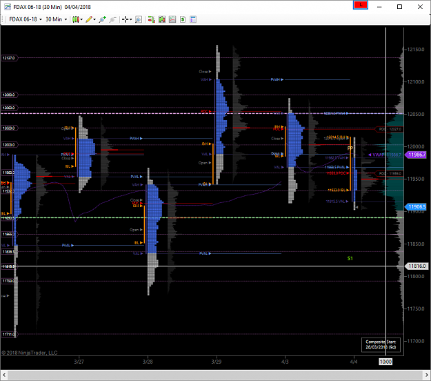
How to read a TPO chart:
The market profile charts, or the so-called TPO charts, might look complicated to many. But actually they are not complicated, they are just different and they compresse many data points into one profile in contrast to standard candlestick chart, where one bar consists just 4 data points, open high low and close. To simplify the process, I am going to concentrate on the following 3 aspects of the market profile:
Goals:
Writing a journal is about to bring accountability into my trading and accountability induces professionalism. Putting my journal in front of the public is not about showing off or bragging about myself by only showing the winning trades. It is about acting with full honesty and total transparency that I would expose both the bright side and shadow side of my ego. I am aware that my ego loves to be right even more than to be profitable. It loves to pick tops and bottoms so that it feels like on top of the world. My ego also loves instant gratification that it prefers quick but small profit instead of the slow but large profit. The best form of response to the ego is not to criticize them but to expose them under the sun and let the ego dissolve like the candle flame in the sea of overwhelming sunlight.
Description of the methodology:
The methodology can be described by the acronym B.A.P.:
B(ias) -- The directional bias describes the sentiment of the higher time frame player. This bias is derived from the market profile chart (see later section for more details)
A(rea) -- Area of interest is the location where either the responsive or initiative players are likely to step in the market to either initiate a move or defend their position. It is mostly derived from the market profile chart (see later for more details).
P(attern) -- Short term price action pattern helps me to refine entry. The patterns that I am watch in the uniRenko charts are, Wolfe pattern, cup and handle, Harmonic patterns and so on.
Premise of the methodology:
Firstly, Market profile is not an indicator. If you are looking for an indicator which gives you buy or sell signal, then this thread is not for you. The goal of the market profile is to visualize the context. It seeks to bring the background to the forefront.
You might ask, what context you are talking about here? Does market profile describes the economy or the monetary policy? The answer is no. The market profile depicts how the speculators, your competitors, are positioned in the market. Believe it or not, 80% of the market movements are not caused by the new money coming into the market but by the repositioning of the higher time frame speculators that are in the market already. This process is called inventory adjustment. The inventory adjustment could be caused by a shift in the sentiment, change in the fundamental condition, or simply, correcting an excessively long/short inventory. Please refer to Jim Dalton’s book, Market in Profile, for detailed discussion over the topic of inventory imbalances.
I truly don’t know and don’t care about the true cause the higher time frame trader’s inventory adjustment activity. But I can decypher those activities in the market profile charts. There is no better way to gain an edge than knowing how your competition is feeling, the probability of what they are doing, and how they are likely to react? The million dollar question is how?
Remarks: Why Market profile works
I don’t want to bloat my post to several page long preach of the auction market theory and the market microstructure. All you need to know is that for every buy there is someone taking the other side. There can be no such thing as “more buyers than sellers”. Everytime I heard from those so-called trading coaches saying something like “the market goes up because there is more buyers than sellers”, I just could not help to roll my eyes. Because it is not possible. Once an auction completes, there has to be equal numbers of buyers and sellers, always. The importance of this axiom is that a well traded balanced area contains a large number of buyers and sellers. Once price being pushed away from that balance, one side of the market is going to feel the pain and is likely to cover their position. This is going to create a run or impulse via either long liquidation or short covering. Our job is to identify the side who is feeling the pain and profit from their losses.
How to read a TPO chart:
The market profile charts, or the so-called TPO charts, might look complicated to many. But actually they are not complicated, they are just different and they compresse many data points into one profile in contrast to standard candlestick chart, where one bar consists just 4 data points, open high low and close. To simplify the process, I am going to concentrate on the following 3 aspects of the market profile:
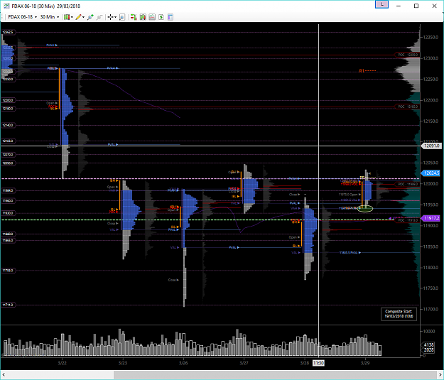
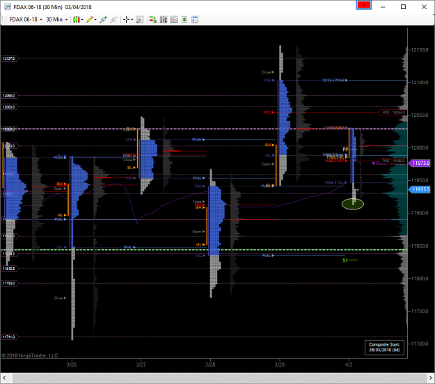
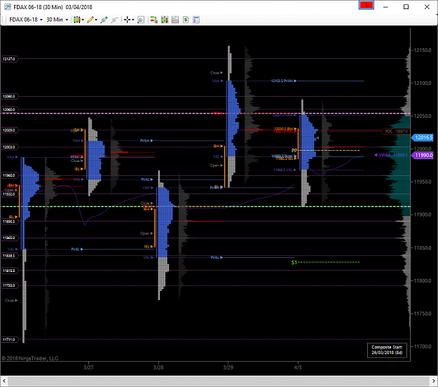
- Location of the balanced (thick) profile from the chart
- Value area of yesterday in relation to where we open today -- inside or outside of the value
- Identify the anomalies in the profile, like gaps, single prints or thin profile, weak high/low.
The balanced profile is where big inventory is built. Big moves are usually initiated from balance. Where we open relative to yesterday’s value area gives me bias and the prior day’s value area gives me trade locations. The anomalies give me targets.
There are mainly four patterns in the TPO chart that I am watching for trading opportunities:
- Double distribution either in daily, weekly or monthly profile. The filling can be expected for the area between to highly traded modes;
- TPO single prints holes expect to be repaired in the near future. Some response can be expected at the first touch;
- Buying and selling tail suggests rejection;
- Balance and break out suggest a start of a new trend.