Trend Following Drawdowns are hitting all time High .
State of Trend Following: Drawdown Levels Comparison
A couple of months ago, we published a study on the performance of trend following after drawdowns, as the State of Trend Following index was hitting high levels of drawdown (about 2/3 of the historical maximum). These periods - to be expected due to the cyclical nature of trend following performance - always trigger the debate whether "trend following is dead" (so far it's always stayed alive) or whether the timing represents a good opportunity to invest in the strategy.
We showed that in 80% of cases, the post-drawdown performance is positive, showing that investing in trend following strategies during periods of under-performance can be beneficial.
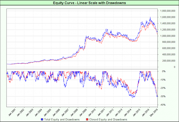
Since the article was published, the performance has kept on the negative side. The drawdown now nearly equals the max historical value (30.3% vs 31.9% as of December 5th), so we decided to keep a close eye on the performance of the index, by putting it in historical context.
Below is a comparison of the short-term performance of the index in the 6 months following the drawdown hitting 2/3 of the max historical value.
https://ci6.googleusercontent.com/pr...comparison.png
The blue line is the current performance line, from September 9th this year, when the drawdown hit 21% (2/3 of the historical maximum). Two months in, it now stands towards the bottom of the chart, where the arrows are located. It is pitted against other past drawdown instances for comparison, and stands in their lower vicinity.
It is the only instance that broke the "90's line" (-10%) within the 6-month window (the May-2011 instance actually did break that line too, but taking a longer time). It is quite obvious on the following chart, with the drawdown curve at the bottom showing different paths to -30% drawdown:
https://ci3.googleusercontent.com/pr...wnGraph_P1.png
The 2011 instance took about 3 years to bottom out at -30%, while this year's instance went there much quicker, in about 10 months. Is it a simple case of "slow and steady" vs. "hard and fast" to reach similar levels? Looking at the drawdowns over the whole length of the back-test shows that there is a vast array of drawdown paths (quick spike down, prolonged downtrend, etc.). It'll be interesting to see which of the up or down arrow the performance follows in the next few months, especially given the levels we're at.
Stay tuned. We'll keep you updated.
State of Trend Following: Drawdown Levels Comparison
A couple of months ago, we published a study on the performance of trend following after drawdowns, as the State of Trend Following index was hitting high levels of drawdown (about 2/3 of the historical maximum). These periods - to be expected due to the cyclical nature of trend following performance - always trigger the debate whether "trend following is dead" (so far it's always stayed alive) or whether the timing represents a good opportunity to invest in the strategy.
We showed that in 80% of cases, the post-drawdown performance is positive, showing that investing in trend following strategies during periods of under-performance can be beneficial.
Since the article was published, the performance has kept on the negative side. The drawdown now nearly equals the max historical value (30.3% vs 31.9% as of December 5th), so we decided to keep a close eye on the performance of the index, by putting it in historical context.
Below is a comparison of the short-term performance of the index in the 6 months following the drawdown hitting 2/3 of the max historical value.
https://ci6.googleusercontent.com/pr...comparison.png
The blue line is the current performance line, from September 9th this year, when the drawdown hit 21% (2/3 of the historical maximum). Two months in, it now stands towards the bottom of the chart, where the arrows are located. It is pitted against other past drawdown instances for comparison, and stands in their lower vicinity.
It is the only instance that broke the "90's line" (-10%) within the 6-month window (the May-2011 instance actually did break that line too, but taking a longer time). It is quite obvious on the following chart, with the drawdown curve at the bottom showing different paths to -30% drawdown:
https://ci3.googleusercontent.com/pr...wnGraph_P1.png
The 2011 instance took about 3 years to bottom out at -30%, while this year's instance went there much quicker, in about 10 months. Is it a simple case of "slow and steady" vs. "hard and fast" to reach similar levels? Looking at the drawdowns over the whole length of the back-test shows that there is a vast array of drawdown paths (quick spike down, prolonged downtrend, etc.). It'll be interesting to see which of the up or down arrow the performance follows in the next few months, especially given the levels we're at.
Stay tuned. We'll keep you updated.
Attached Image (click to enlarge)
Master Your Setup, Master Your self. (NQoos)