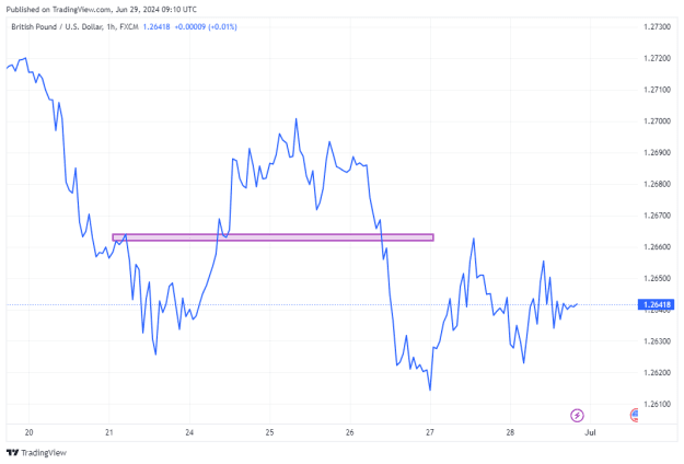
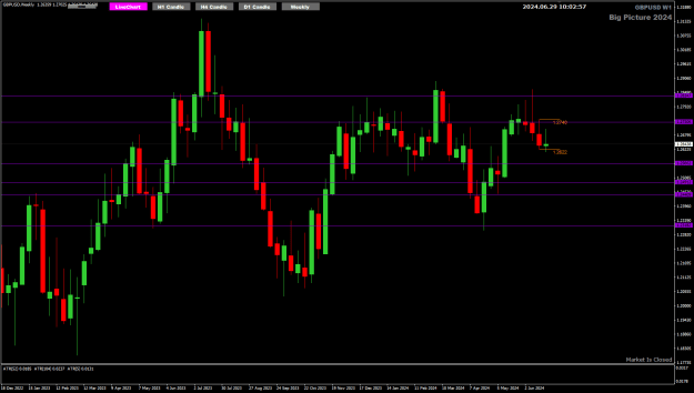
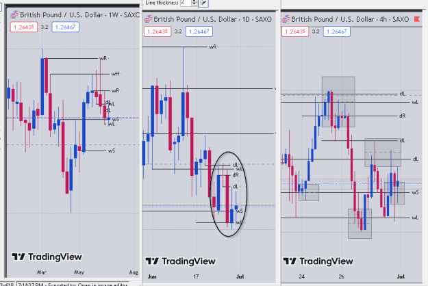
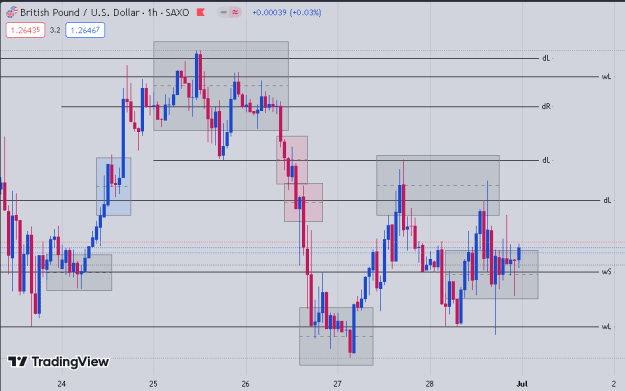
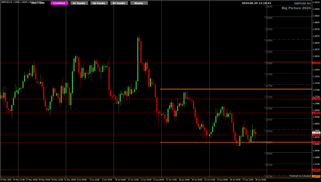
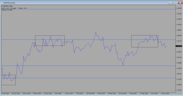
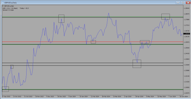
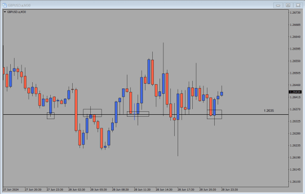
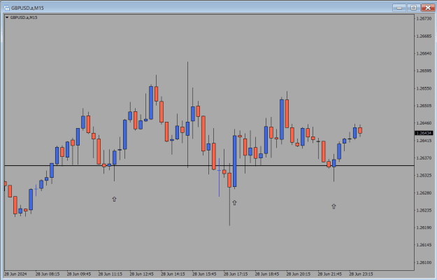
Disliked{quote} just an opinion. switching time frames around would give a better picture. you see the d1 red candle closed above support. using the higher time frame h1 and new york open for entry would be more convincing. {image} {image}Ignored
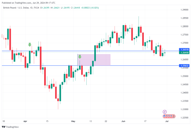
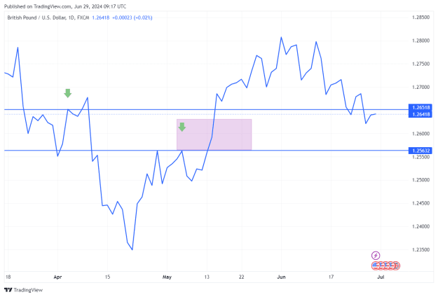
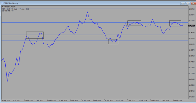
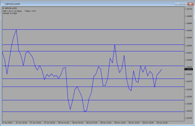
I plot lines on the daily peaks and troughs to see daily SR – I would have used the one higher up
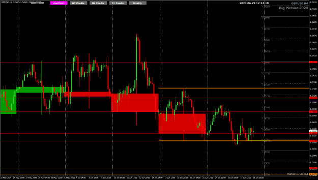
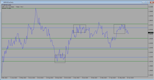
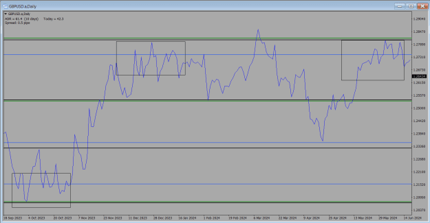
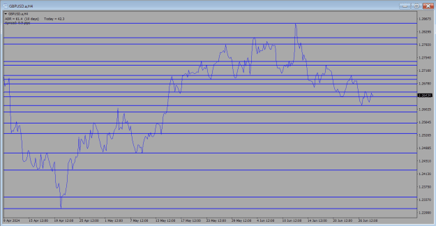
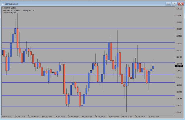
Do you plot the rectangles on the line and candlestick chart also?
Attached Image(s) (click to enlarge)